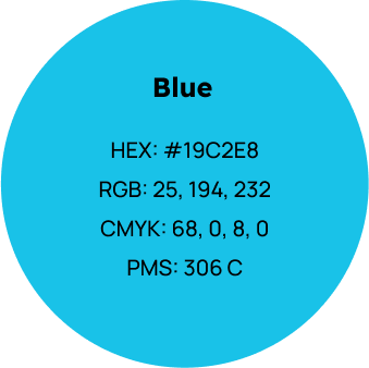
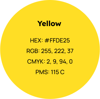
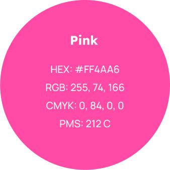
Our palette has 3 primary colours: Blue, Yellow and Pink.
Blue and Yellow are the main colours with Pink being used less often.
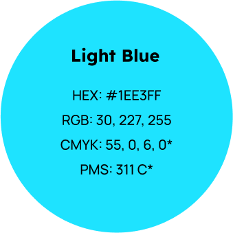
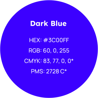
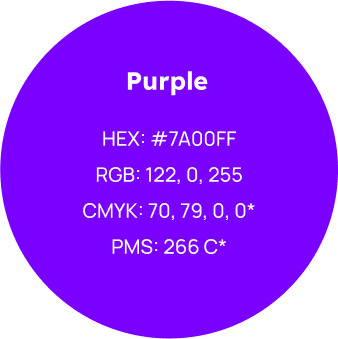
Our secondary colours are Light Blue, Dark Blue and Purple. These should be used sparingly.
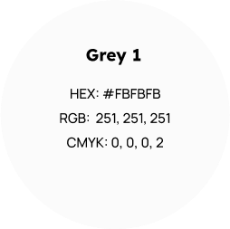
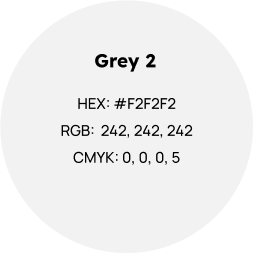
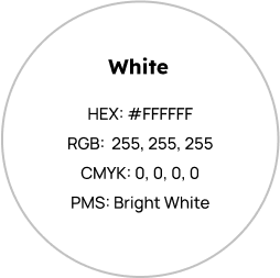
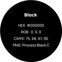
Our base colours are Grey 1, Grey 2, White and Black.
White and Grey should be used as background colours to keep design clean and black is ued for text.
*Colour values may produce different results than seen on this document.
PRIMARY COLOURS
SECONDARY COLOURS
BASE COLOURS
1.2
Grey Tints
We use Grey tints to break up content and in our illustrations (6.0).
Grey 1 and 2 should be used most frequently for background elements.
Darker grey tones should be used to give the depth to illustrations.
Grey 1
C: 0 M: 0 Y: 0 K: 2
R: 251 G: 251 B: 251
#FBFBFB
Grey 2
C: 0 M: 0 Y: 0 K: 5
R: 242 G: 242 B: 242
#F2F2F2
Grey 3
C: 0 M: 0 Y: 0 K: 10
R: 230 G: 230 B: 230
#E6E6E6
Grey 4
C: 0 M: 0 Y: 0 K: 14
R: 220 G: 220 B: 220
#DCDCDC
Grey 5
C: 0 M: 0 Y: 0 K: 20
R: 204 G: 204 B: 204
#CCCCC
Grey 6
C: 0 M: 0 Y: 0 K: 24
R: 193 G: 193 B: 193
#C1C1C1
Grey 7
C: 0 M: 0 Y: 0 K: 31
R: 176 G: 176 B: 176
#B0B0B0
Grey 8
C: 0 M: 0 Y: 0 K: 37
R: 160 G: 160 B: 160
#A0A0A0
Grey 9
C: 0 M: 0 Y: 0 K: 42
R: 147 G: 147 B: 147
#939393
Grey 10
C: 0 M: 0 Y: 0 K: 47
R: 134 G: 134 B: 134
#868686
Grey 11
C: 0 M: 0 Y: 0 K: 55
R: 116 G: 116 B: 116
#747474
1.3
Colour Balance
To maintain an appropriate colour balance, only White, Grey and Blue should dominate the canvas.
Blue accents should always feature and Black and other colours should never be used as a background colour.
Primary colours should be distributed suitably throughout a document or canvas.
The colour hierarchy (A) represents a general guide for the overall brand.
The colour hierarchy does not apply to photography.
A. Colour Hierarchy
Acceptable colour balance.
Acceptable colour balance.
Acceptable colour balance.
Acceptable colour balance.
Not enough Blue.
Too much Blue.
2.0
Logo
2.1
Logo Elements
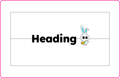
This is the Flickpost logo, it comprises the logotype, in lower case; and the logomark, which is a leaping bunny.
The default colours for the logo should be white on a blue background.
2.2
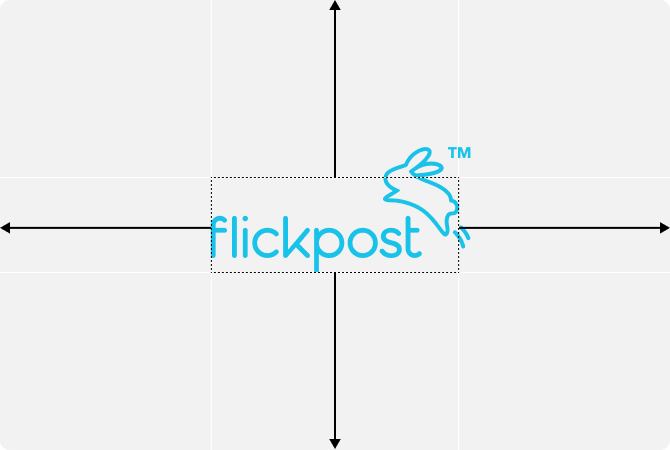
Logo Centering
When centering the logo,
the entire logo should not be centered.
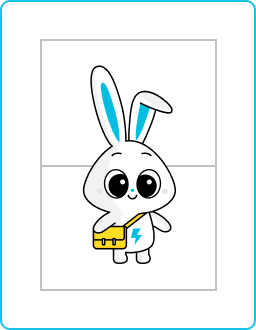
To center the logo, use the area as seen here (A).
The centering area should reach just underneath the bunny’s ears and end at the bunny’s tail.
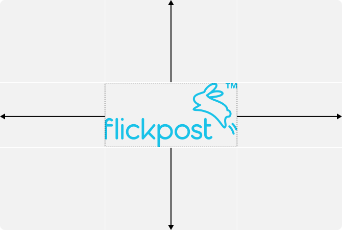
Correct centering.
(A) Use this area to center the logo correctly.
Incorrect centering.
The entire logo should not be centered.
2.3
Favicon
Our favicon should include the bunny only and not the logotype.
FAVICON VARIATIONS
2.4
Logo Placement
When placing logos on the canvas, avoid putting logos in the top-left of the canvas.
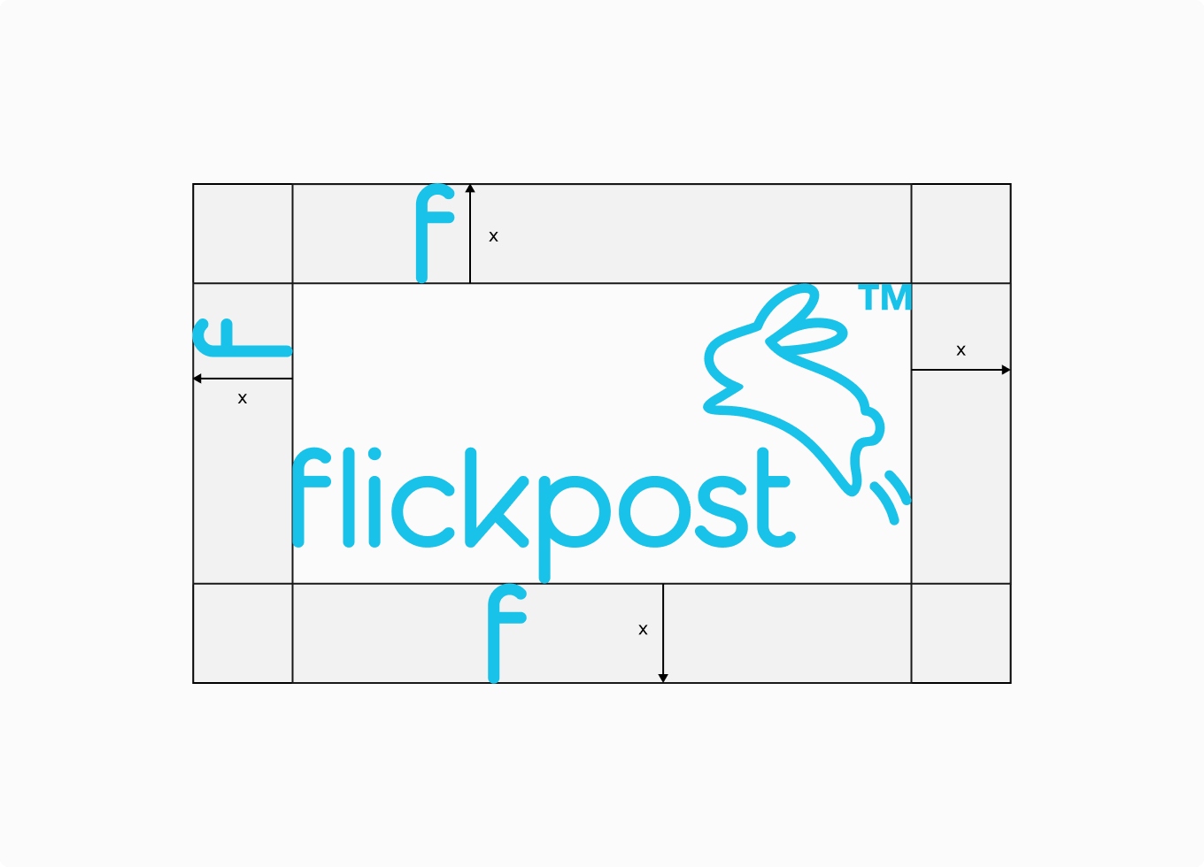
2.5
Logo Safe Zone
The safe zone can be calculated by using the height of the ‘F’.
2.6
Logo Violations
The logo should not be altered in any way, here are some examples of things to avoid.
Approved logomark.
Do not change the width.
Do not change the height.
Do not change the proportions.
Do not increase the letter spacing.
Do not decrease the letter spacing.
Do not outline the logo.
Do not add a stroke to the logo.
Do not rotate the logo.
Do not alter the letter weight.
Do not displace the letters.
Do not alter the letter paths.
2.7
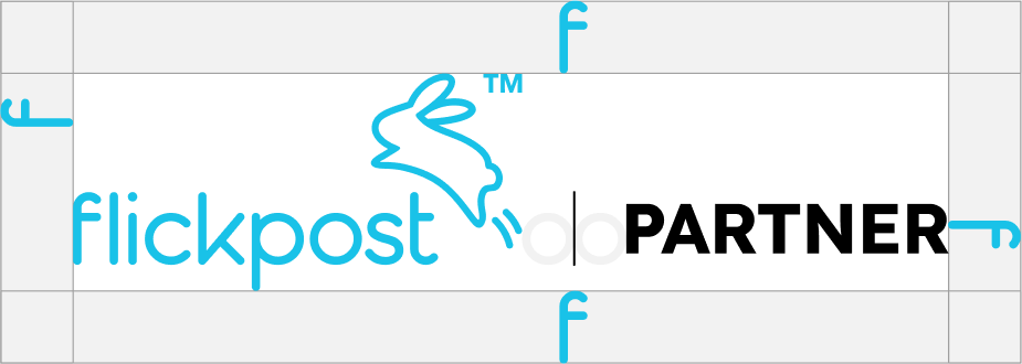
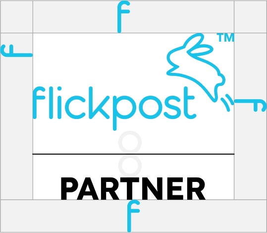
Partnership Lockup
The partnership lockup is used for communication around approved Flickpost partnerships.
We lock up the Flickpost logo with a partner logo, placing the Flickpost logo either to the left or top of the partner’s logo. We add clear space between the logos equal to the size of two ‘O’s (the O found in the logotype Flickpost) and divide this space in half by a vertical or horizontal line.
For horizontal partnership lockups (A), partner logos should be center-aligned to the Flickpost logotype. The vertical line should be the same height as the ‘F’ in Flickpost.
For vertical partnership lockups (B), Partner logos should be center-aligned to the entire Flickpost logo (logotype and logomark). The horizontal line should be the same width as the Flickpost logo.
A. Horizontal partnership lockup
Center-align the partner logo to the Flickpost wordmark
B. Vertical partnership lockup
Center-align the partner logo to the entire Flickpost logo
3.0
Typography
3.1
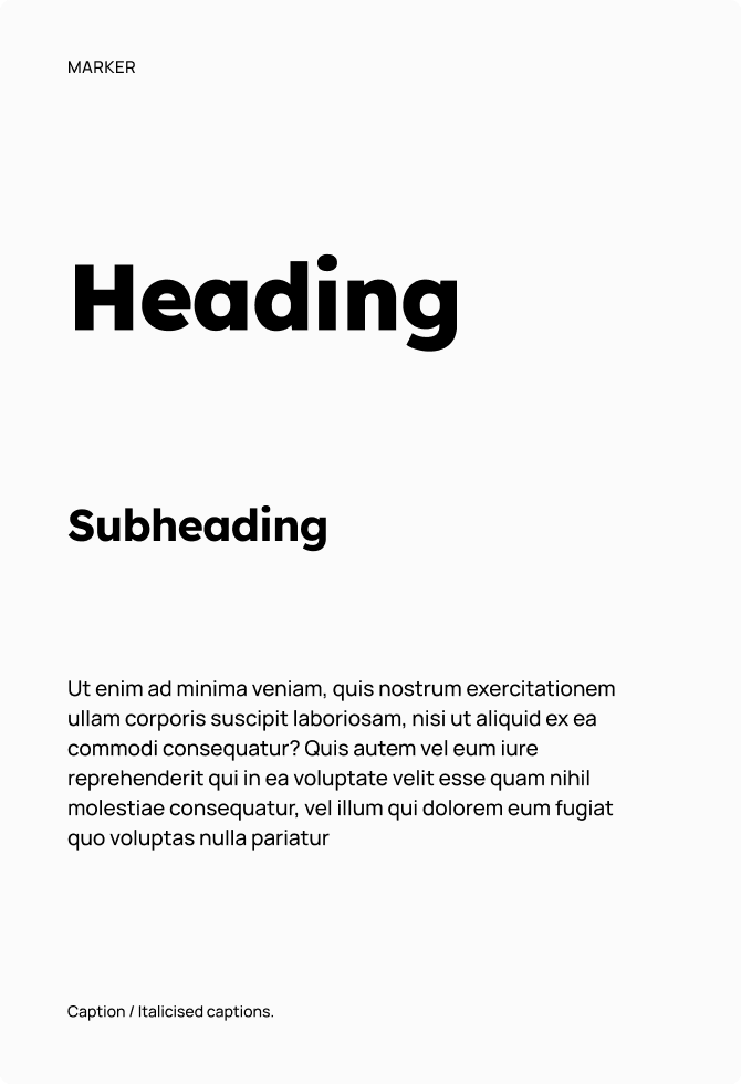
Typefaces
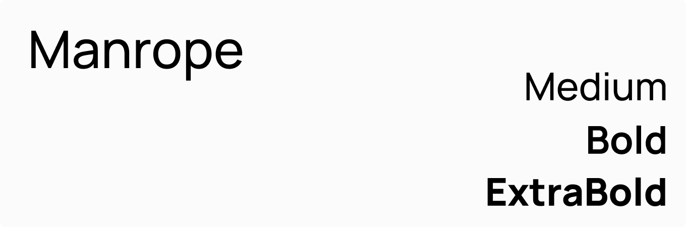
The brand typefaces for all uses are Lexend Deca, for headings, subheadings and page markers, and Manrope for body-text and captions.
Lexend Deca is the heading, subheading and marker typeface.
Manrope medium is the font used for body-text and captions.
3.2
Type Hierarchy
Type elements should be combined to create legible and structured text layouts.
3.3
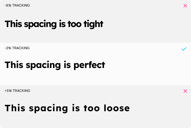
Headings
Lexend Deca Extra Bold is the primary heading font.
Sentence case is the primary usage for Headings.
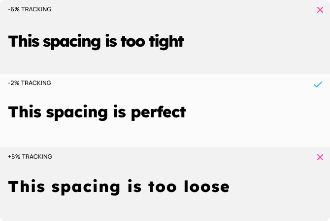
The tracking (letter spacing) should be decreased slightly from the default value.
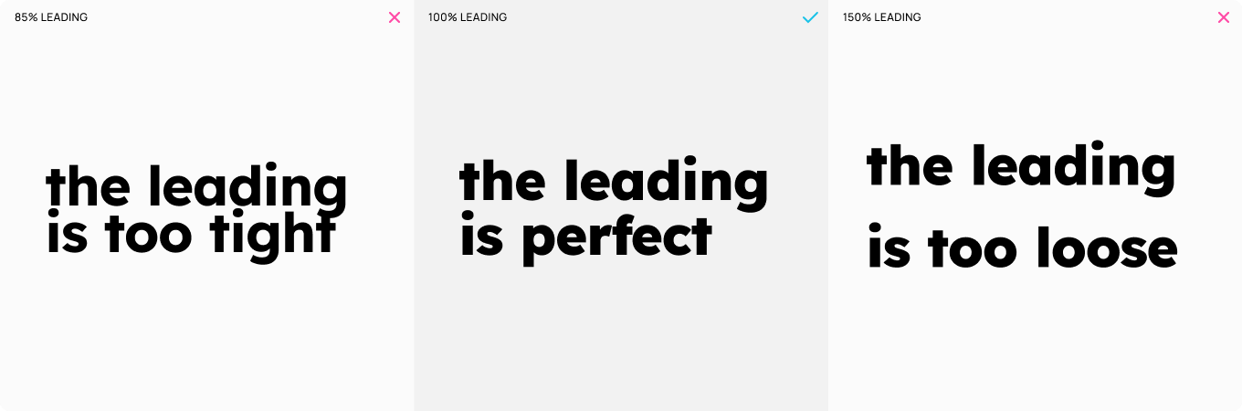
The leading (line spacing) should be set near the default value to ensure that it is comfortable for the reader.
3.4
Subheadings
Lexend Deca Bold is the primary heading font.
Sentence case is the primary usage for Subheadings.
The tracking (letter spacing) should be decreased slightly from the default value.
The leading (line spacing) should be set near the default value to ensure that it is comfortable for the reader.
3.5
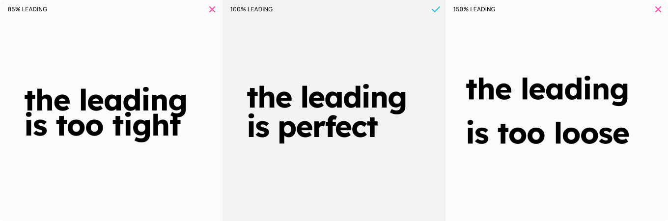
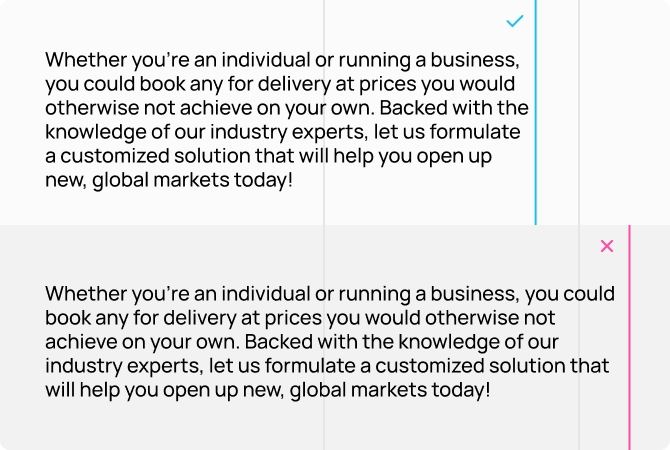
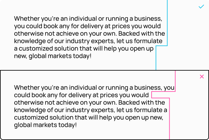
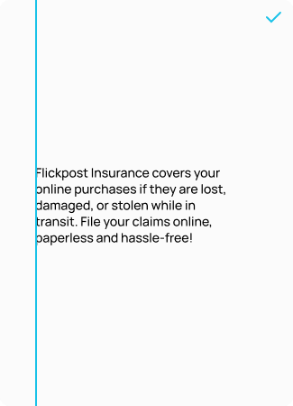
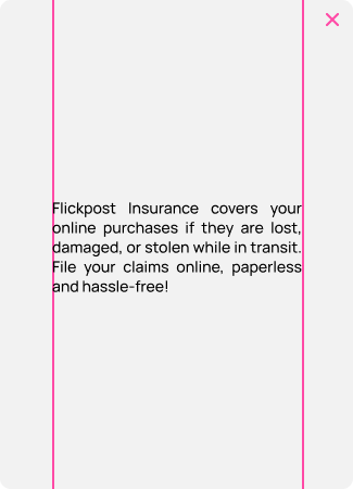
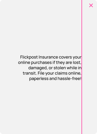
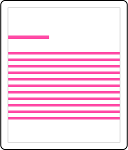
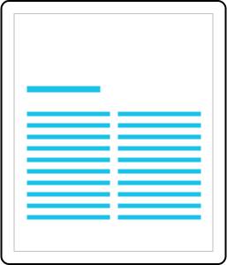
Body-Text
Manrope Medium is the primary body-text font.
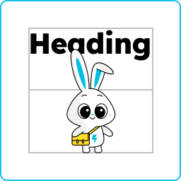
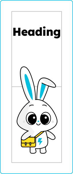
The safe zone here is determined between the two vertical dark grey lines.
Where possible try to maintain aligned edges by using appropriate line breaks.
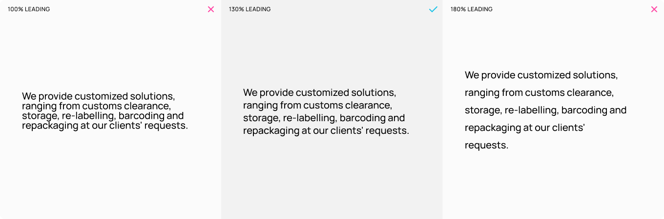
The leading (line spacing) should be set at a value that is comfortable for the reader.
3.6
Markers
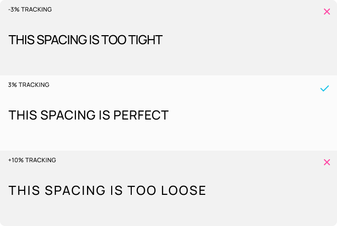
Manrope Medium in upper case is the primary font for markers.
Markers should not be written in lower case.
The tracking (letter spacing) should be slightly above the default value.
A few examples of how markers can be used in design are section markers, time markers and forms.
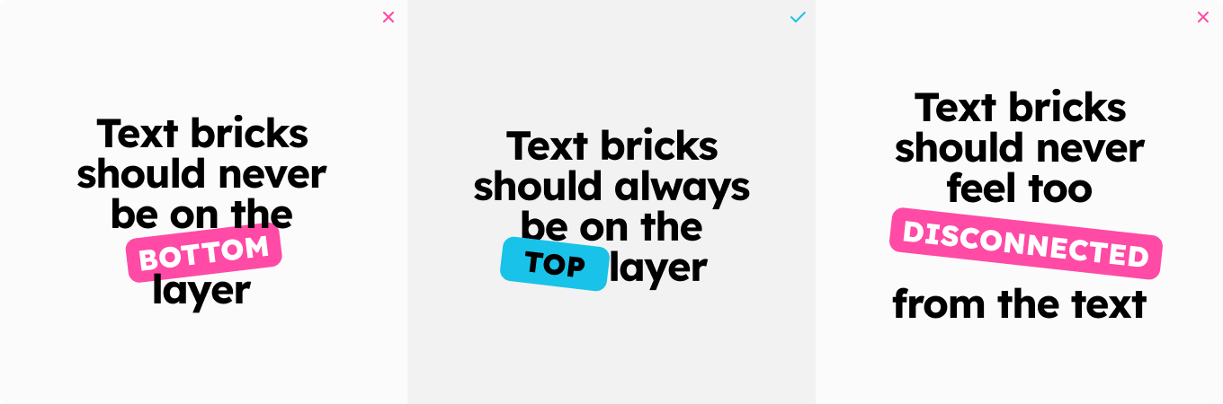
3.7
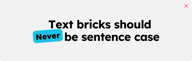
Text Bricks
We use text bricks to emphasise our copy.
You can find how to create a brick on in section 4.3.
Avoid using upper case for subheadings.
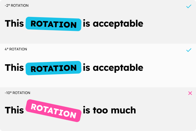
Rotation can be a maximum of 8°.
Text bricks should always be placed on the top layer and should feel connected to the surrounding text.
3.8
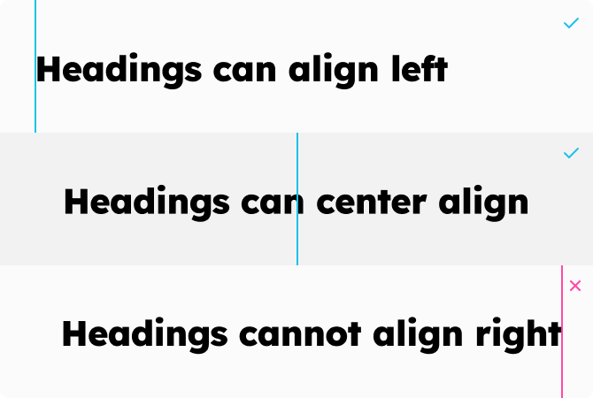
Alignment
The default alignment for type layouts are left, but can also center align.
By default, headings should align left. Headings should never align right.
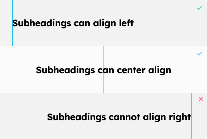
Subheadings must only align left.
By default, body-text should align left but can also center align.
4.0
Brick Elements
4.1
Dynamic Brickwork
Our visual elements are called bricks and we stack them together to create dynamic brickwork compositions, ensuring designs stay fresh and avoid repetitiveness.
4.2
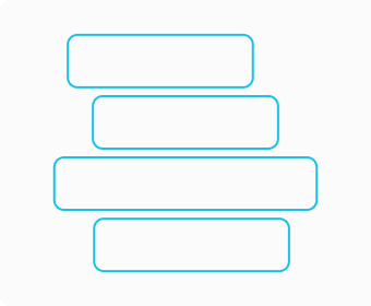
Brickwork Construction
Our visual elements are called bricks and we stack them together to create dynamic brickwork compositions, ensuring designs stay fresh and avoid repetitiveness.
An example of a 2 brick construction.
An example of a 4 brick construction.
An example of a 3 brick construction.
An example of a 4 brick construction.
An example of a 3 brick construction.
An example of a 4 brick construction.
4.3
Brick Creation
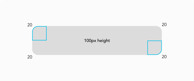
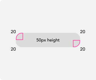
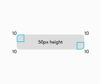
Brick components are created from rectangles that are 100px in height with a corner radius of 20.
Corners should be scaled when resized.
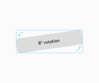
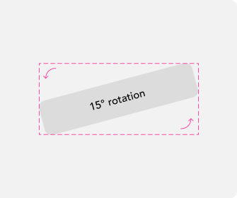
Bricks must only be rotated by a maximum of 8 degrees.
Minimum brick ratio is 3:1
(300px width : 100px height)
Maximum brick ratio is 6:1
(600px width : 100px height)
Bricks are created from a rectangle, 100px in height and a corner radius of 20.
Incorrect corner radius scaling.
Correct corner radius scaling.
Bricks can have a max rotation of 8°.
Bricks cannot rotate beyond 8°.
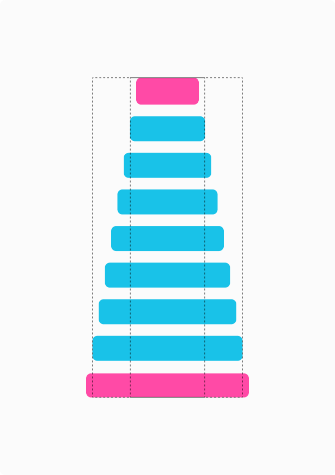
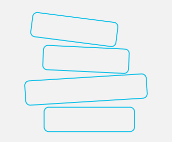
The blue bricks are acceptable brick proportions.
4.4
Bricklaying Process
Brickwork constructions can be made with a 4-step process.
Here are some examples of how to make constructions with 2, 3 and 4 separate bricks.
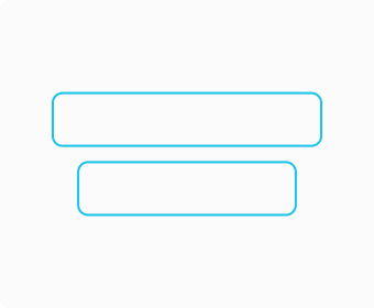
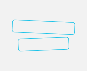
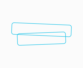
Step 1: Create 2 bricks.
Step 2: Rotate bricks.
Step 3: Overlap bricks.
Step 4: Merge and colour bricks.
Step 1: Create 3 bricks.
Step 2: Rotate bricks.
Step 3: Overlap bricks.
Step 4: Merge and colour bricks.
Step 1: Create 4 bricks.
Step 2: Rotate bricks.
Step 3: Overlap bricks.
Step 4: Merge and colour bricks.
4.5
Invalid Brickwork
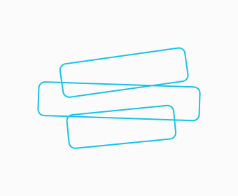
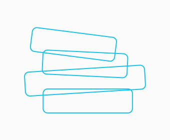
Here are some examples of brick compositions rules that are not valid.
Not all bricks are overlapping.
Not enough variation in brick rotation.
Bricks are too disconnected.
Brick layers are too compressed.
Bricks are too disconnected.
Composition is too symmetrical.
No variation in brick width.
Not enough brick rotation.
5.0
Frames & Grids
5.1
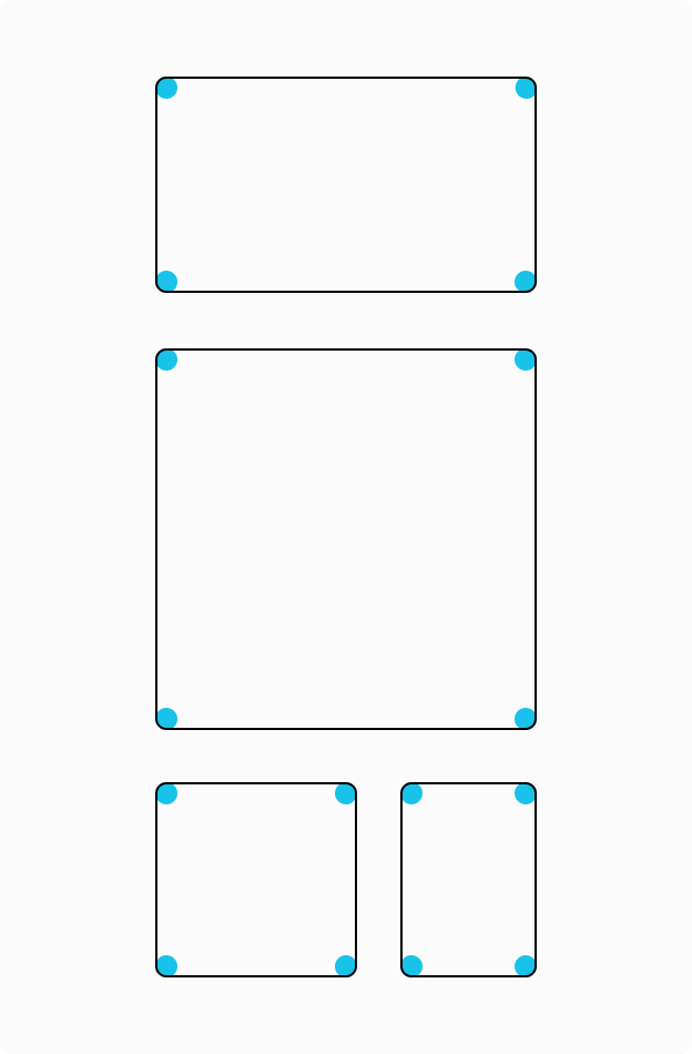
Rounded Frames
We use rounded frames where possible.
Corners should have a subtle curve and when a series of frames are being used together, all corners should be equal.
Acceptable, rounded frame consistency.
Acceptable rounded frame.
Frame is not rounded.
Acceptable rounded frame.
Frame corner radius is too high.
Frame corners are consistent.
Frame corners are not consistent.
5.2
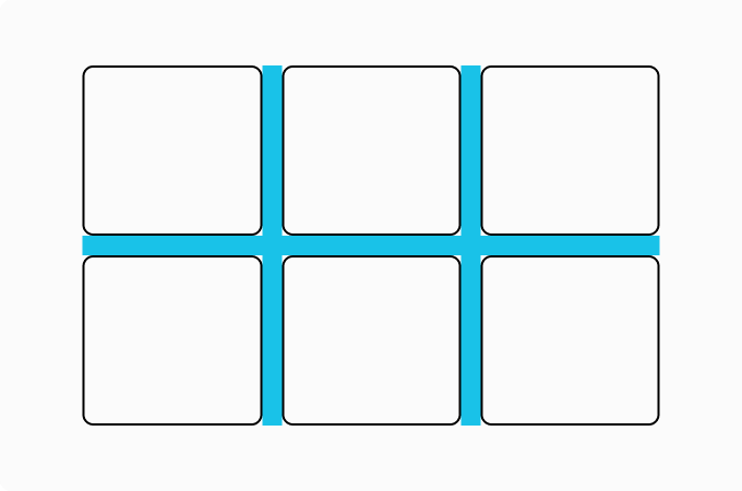
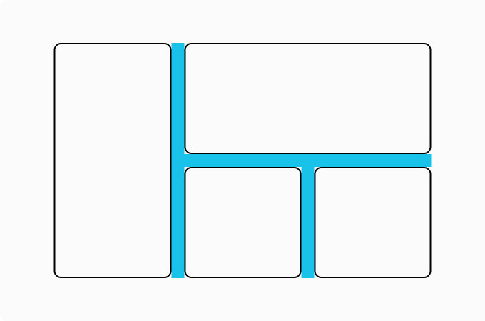
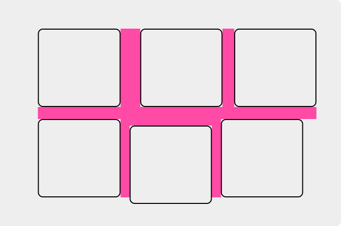
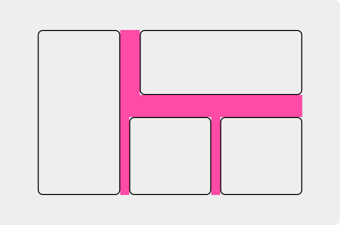
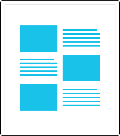
Content Grids
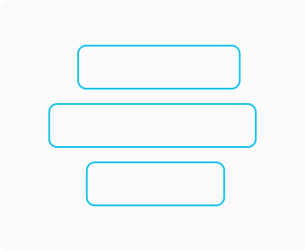
When creating content grids, the spacing between frames must remain consistent.
Standard grids and masonry grids are both acceptable ways to display content.
Example of perfect spacing between frames of the equal size.
Example of perfect spacing in a masonry grid.
Inconsistent spacing between frames.
Inconsistent spacing between frames.
5.3
Brickwork Frames
Brick compositions can be used as frames.
Here are some examples of how they can be used.
6.0
Illustrations
6.1
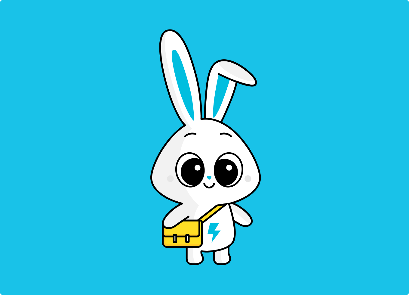
The Flickpost Bunny
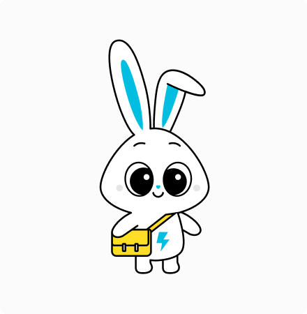
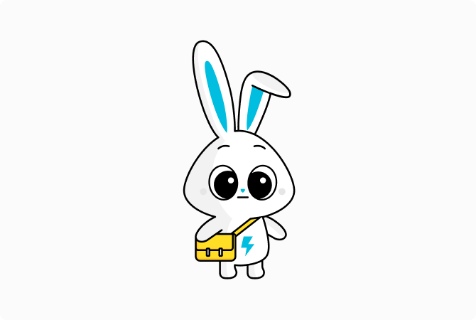
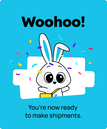
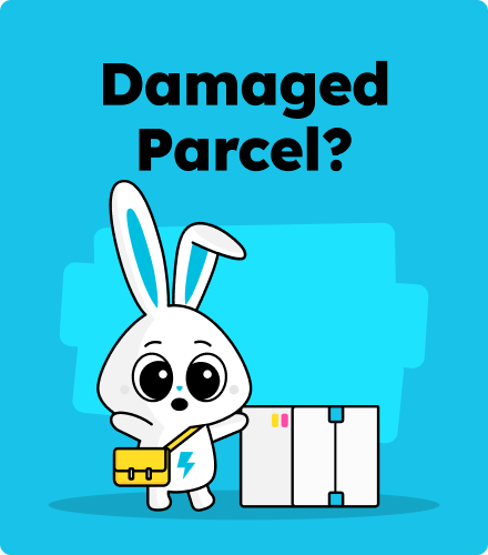
The face of our brand is the Flickpost bunny and should be regularly used in our marketing as a recognisable brand asset.
6.2
Character Creation
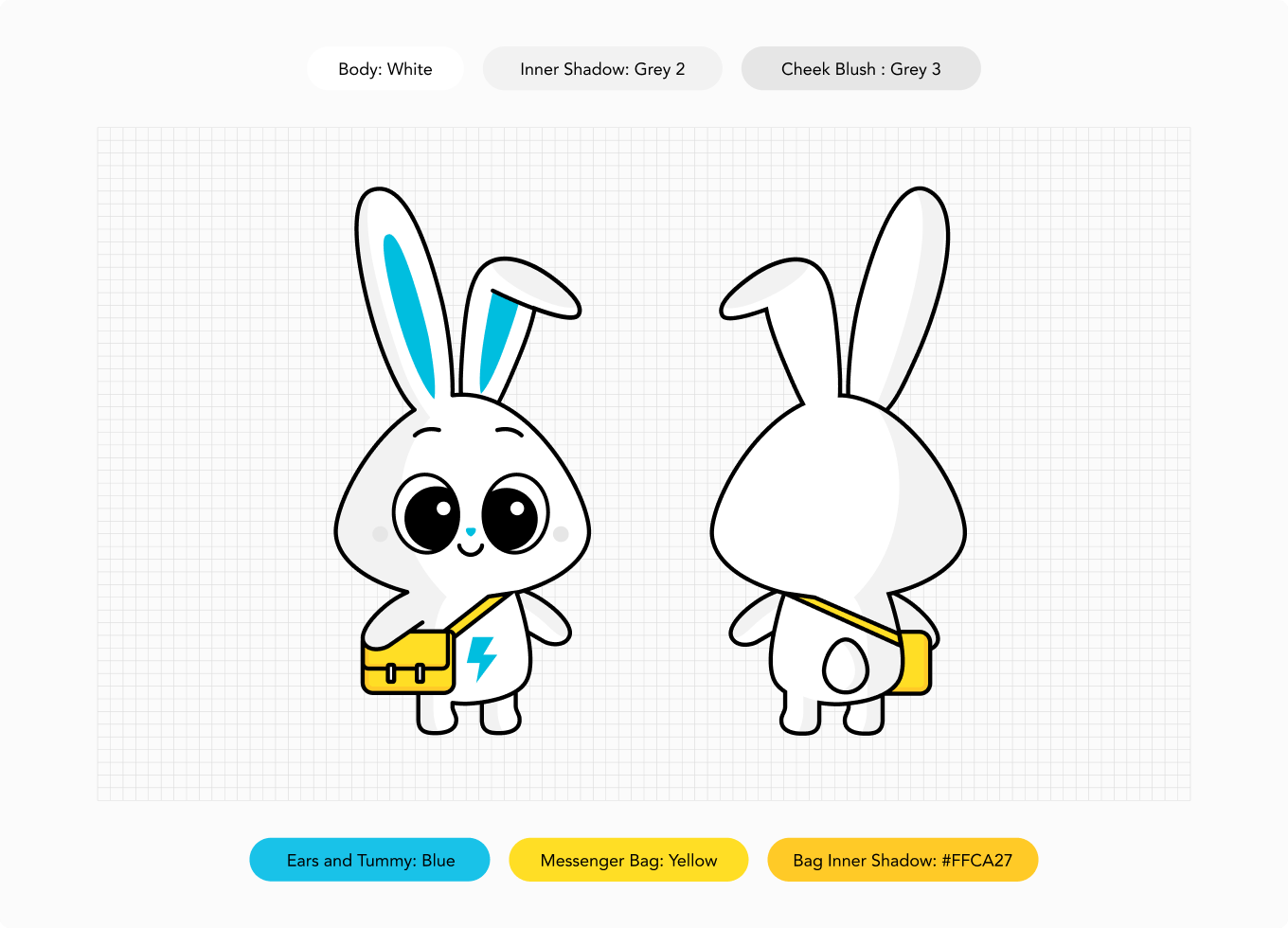
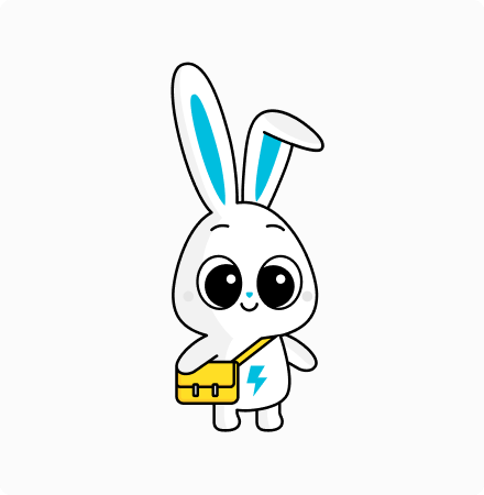
The Flickpost bunny is made using 4 colours only: White, Blue, Yellow and Grey 2.
6.3
Character Composition
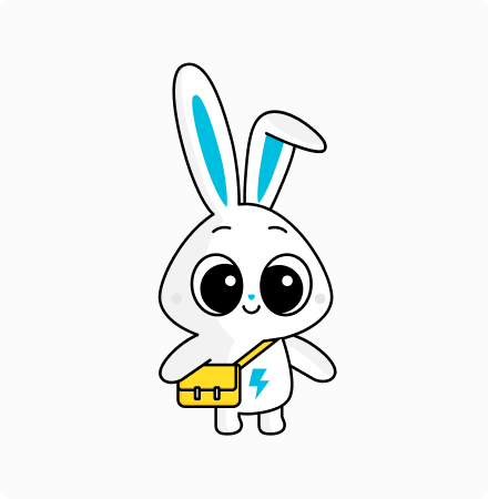
The Flickpost bunny can be created in 3 steps.
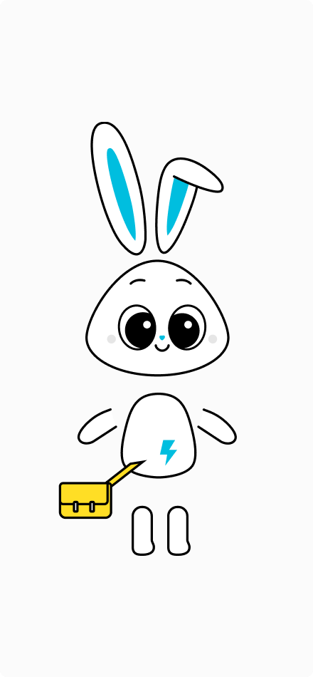
Use the character source file to make compositions with separate body parts.
Step 1: Find all body parts in the character source file.
Step 2: Layer body parts like this example.
Step 3: Merge components and add inner shadow.
6.4
Character Violations
Use the character source file for references of correct usage.
Here are some things to avoid when creating characters.
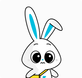
Acceptable character composition.
The character stroke must be scaled.
Correct character proportions must be maintained.
Do not change shape of body parts.
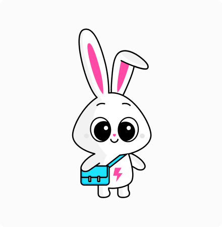
Do not change colours.
Do not remove shadows and tones.
6.5
Expressions
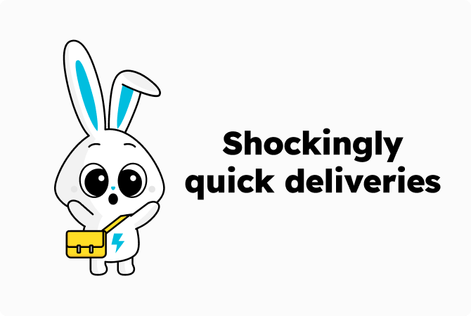
Different expressions should be used to keep the creative fresh.
Choosing the right expression and gestures are key to ensuring the creative is visually engaging and relevant.
Facial features can be found in the character source file.
6.6
Expression Rules
The Flickpost bunny should always be positive, unless being used in conjunction with relevant copy.
This is the default expression that should be used.
Expressions should always be positive if used without relevant copy.
Expression is relevant to the copy.
Expression is relevant to the copy.
6.7
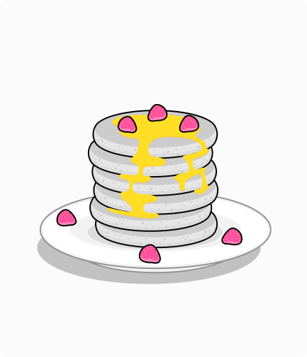
Objects
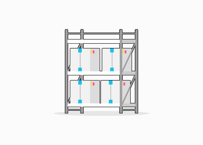
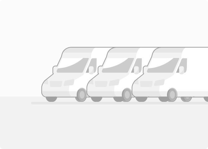
Our illustrations also include other objects, using Grey tones (1.2) and pops of colour.
6.8
Background Scenes
Grey tints should be used for background details in order to not distract from the main foreground image.
7.0
Stickers
7.1
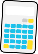
Sticker Style
Our sticker style is quirky and colourful.
They are made with grey tones with pops of primary colours.
8.0
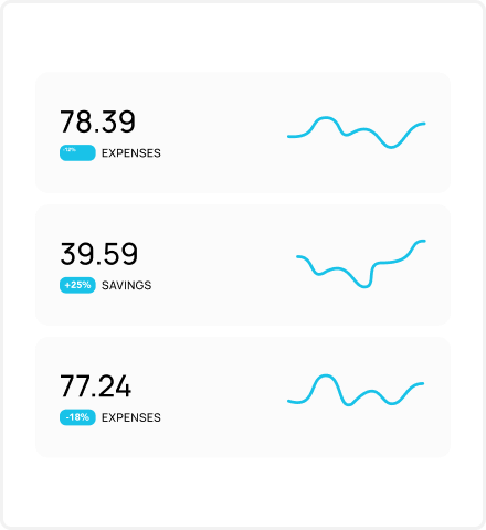
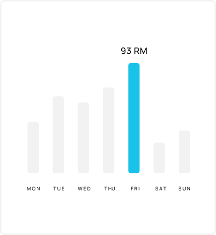
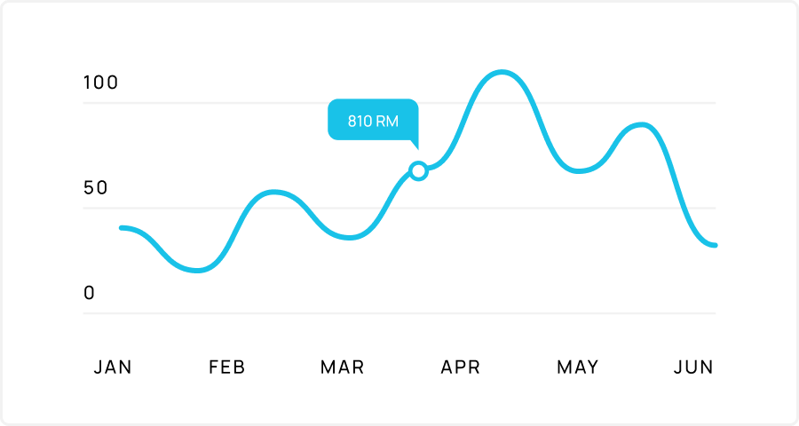
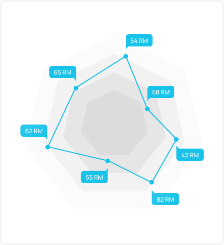
Infographics
8.1
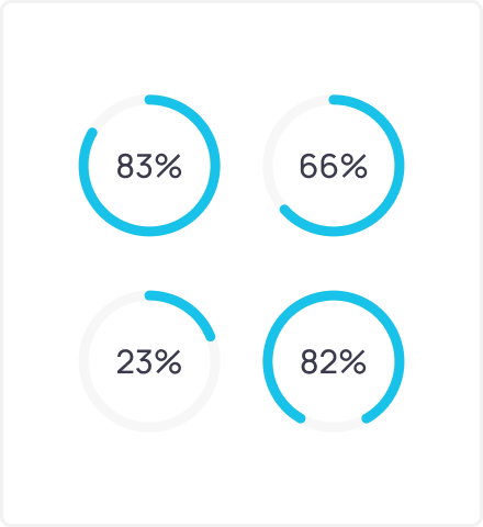
Data Visualization Style
Our infographics are minimal and clean.
Try to use Blue to represent important data and Grey tints to break up formulate the rest of infographic.
9.0
Composition
9.1
Defining Margins
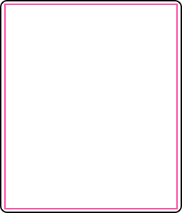
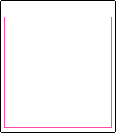
There is no exact formula for calculating margin sizes. Discretion should be used and a comfortable space should be applied for all page sizes.
The margins are a good size.
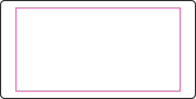
The margins are too small.
The margins are too big.
The margin is asymmetric.
The margins are a good size.
The margins are not equal.
The margins are a good size.
The margins are off-center.
The margins are a good size.
The margins are not appropriate.
The margins are not equal.
The margins are not equal.
9.2
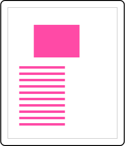
Creative Proportions
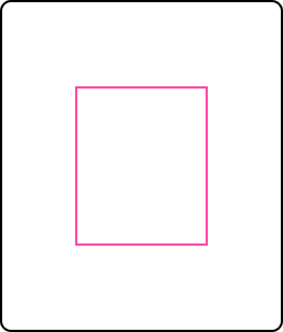
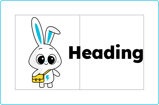
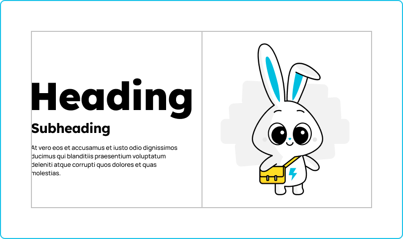
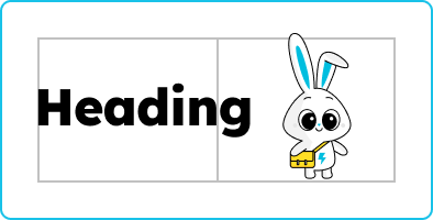
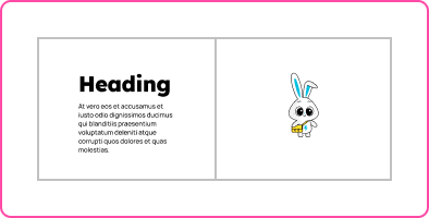
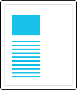
For marketing communications, the hero visual should be big and impactful on the page.
You can approximate the size by creating a central content area, dividing the area by 2 and then ensuring the visual can roughly fill one of these halves.
9.3
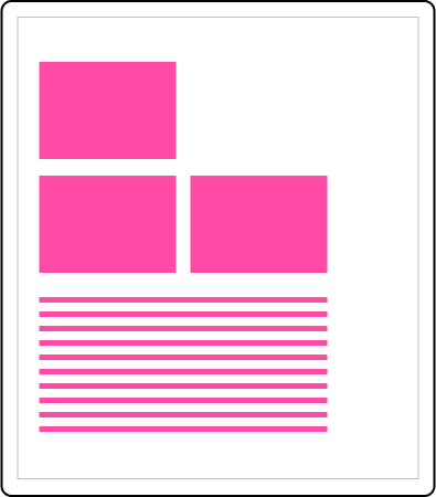
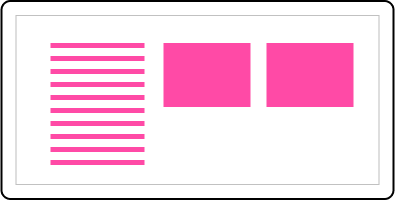
Content Layout
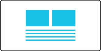
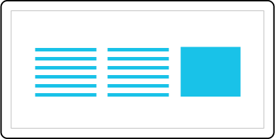
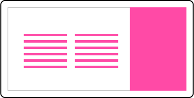
Content layouts that are text-heavy, such as print documents should never be cluttered and have good harmony on the page.


